Team: 4 Human Factors Graduate Students
Role: Product Analysis, Design, and Testing
Location: San Jose, CA, United States
BACKGROUND
After analyzing the Bart ticketing system, going to the Bart train station, and talking with some of the people using it, we looked closely into its user flow and decided to redesign it.
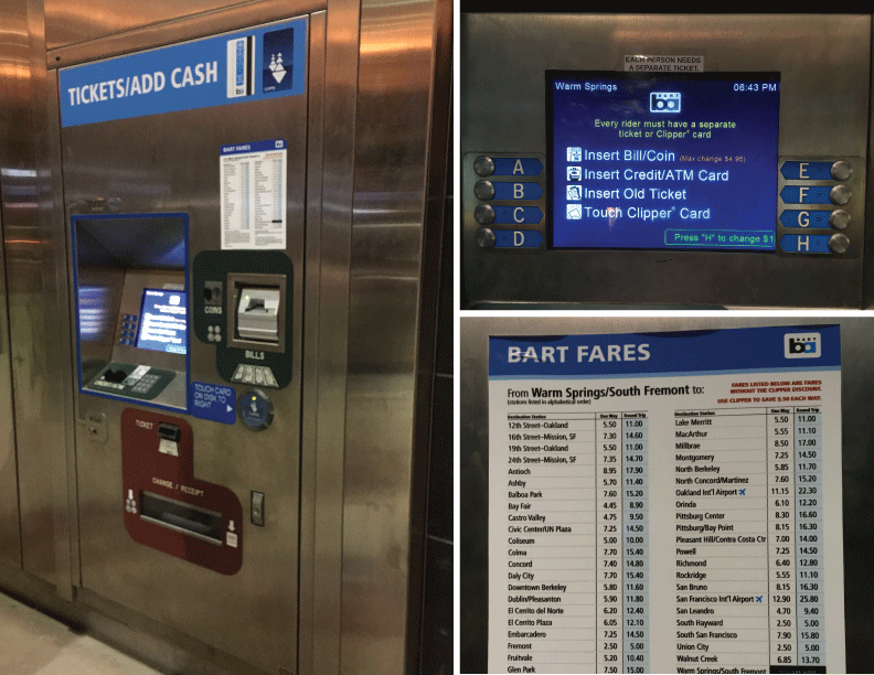
MAIN ISSUES WITH CURRENT INTERFACE:
- Options in the initial interface are not properly aligned with physical buttons, which may cause confusion and error.
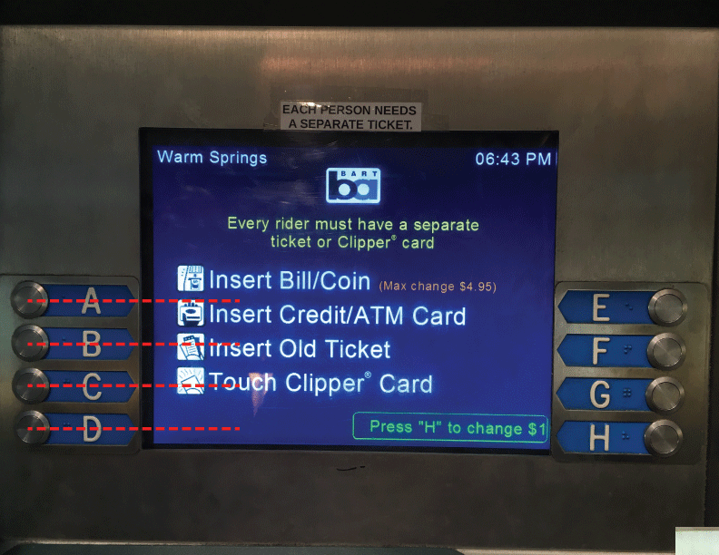
- User flow is time-consuming having to add and subtract by 1 dollar or 5 cents to reach the exact price of fare. This is especially important since users can be in a hurry to catch the train.
- Unnecessary memory load is given to the user for memorizing 3 to 4 digits of the exact fare he/she needs to pay
- Machine will only give $4.95 back in change which may be inconvenient for the user.
- There is inconsistency within the design of the system since on the right side, only button “H” is active while buttons A through G are not.
- There’s no map near the ticketing machine (nearest map is than 50 feet away) , so if users don’t know exactly what station they want to visit, they have to go to take time to walk to the map and back.
- Even though the Bart train is used by locals as much as tourists, the menu is only in English. Anybody that doesn’t know how to speak English would have extra difficulty buying a ticket.
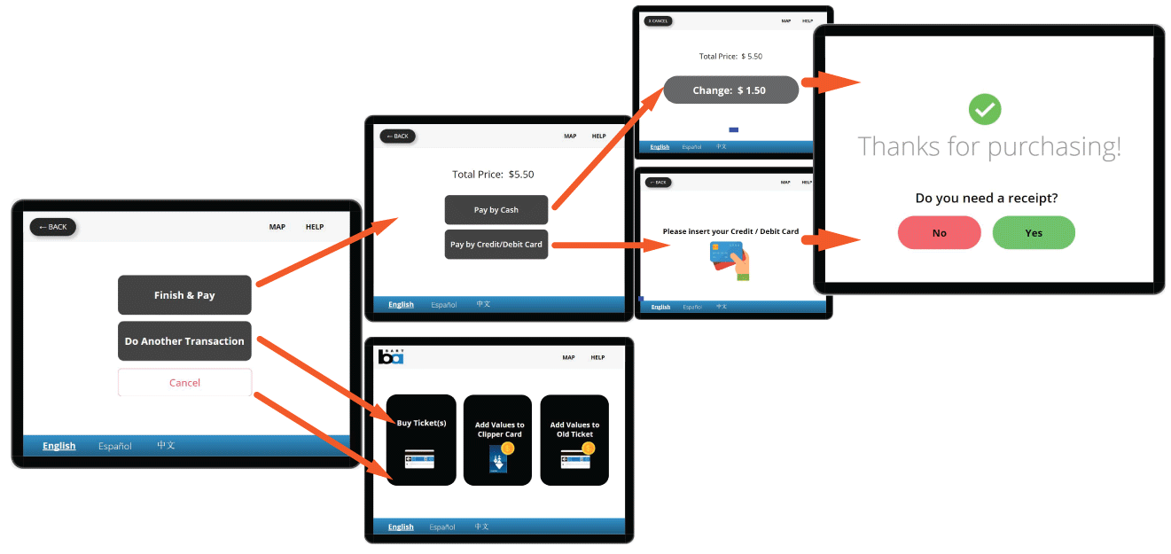
- Users can only make one transaction at a time, which is time-consuming if they want to buy a ticket for someone else and add more money to their existing ticket or ClipperCard.
- Machines for getting a Clipper card look almost identical with the ticket machines and are mixed in between each other, it’s really hard to differentiate one from the other.
REDESIGN
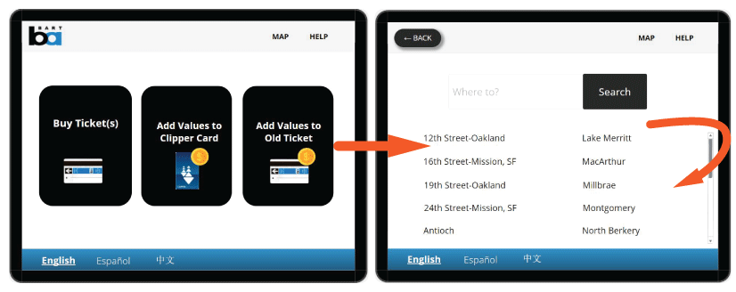
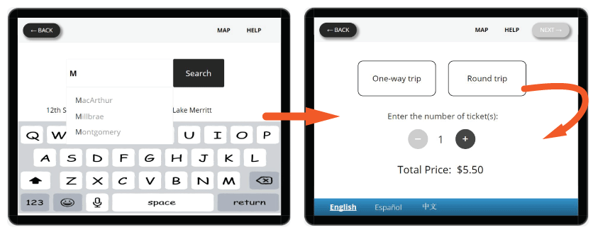
Our proposal involves turning the interface into a touch screen to improve the user’s experience with the system and avoid any alignment issues like the ones previously shown. Maintaing the same dimensions of the screen, we decided to simplify the initial screen and make the background white to improve visibility. We’ve included a map users can access and zoom-into for looking up the desired station. Additionally, further languages have been added to assist tourists visiting the Bay Area who don’t know English well.
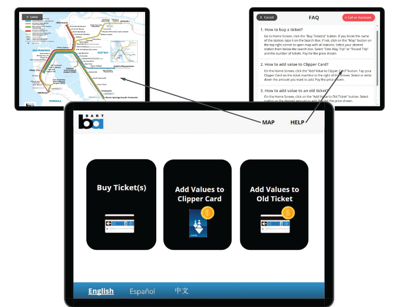
USER FLOW FOR BUYING A TICKET
Predictive search by station name helps users find their station more in an easy and quick manner.
USER TESTING AND RESEARCH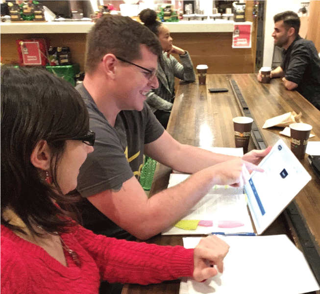
Usability testing was done where the participants were presented with a screen of similar size to Bart’s ticketing machines, where they had to complete 7 tasks. These tasks were similar to the tasks normally performed by users on a Bart train station.
Qualitative information was obtained through observation, conversation with the user and note-taking during the test. Meanwhile, quantitative information was acquired through two surveys the users had to complete. The first survey was done after each task where users had to rate how confident they were of having completed the task successfully on a scale from 0 to 10.
IMPROVEMENTS BASED ON USER RESEARCH
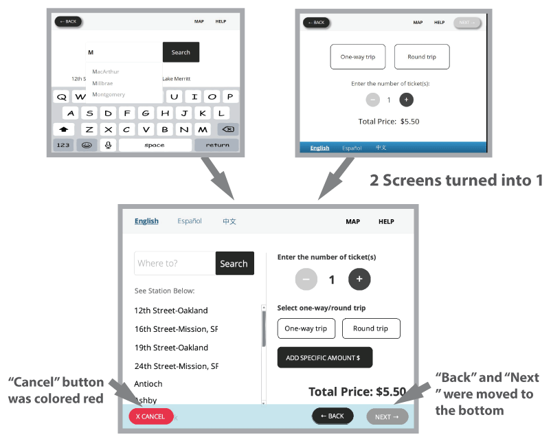
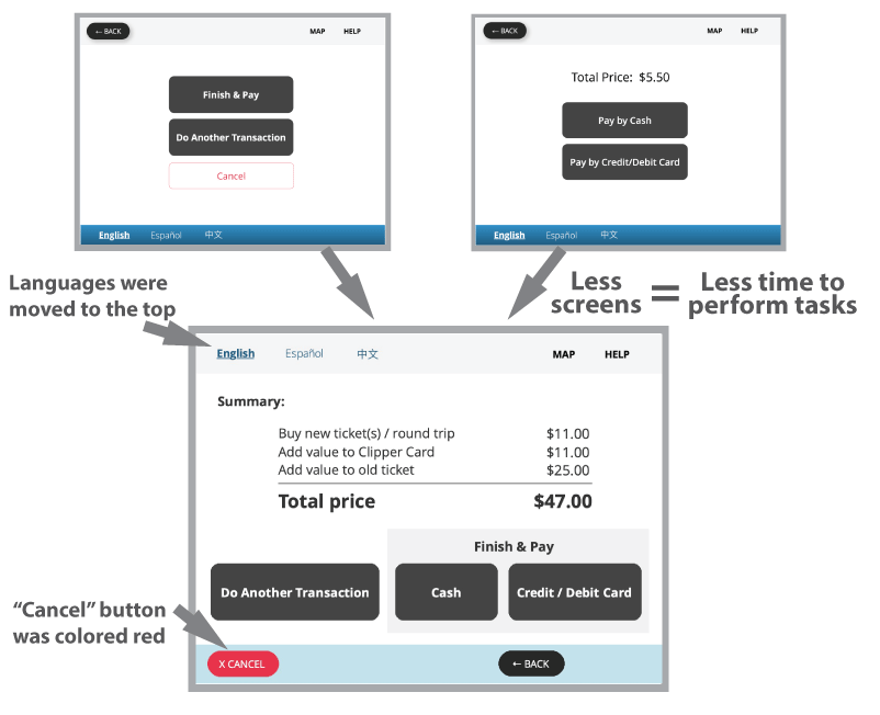
After testing our design on some participants, even though most of them did feel our design gave them a better experience buying a ticket, they still thougth they had too many steps to take to reach their goals, which means they thought it still took too long to buy a ticket. Other main issues were users missing important buttons like the “Back” and “Next” buttons, which were expected to be found at the bottom instead of the top. Ahead are some of the improvements made based on the findings from the usability tests.
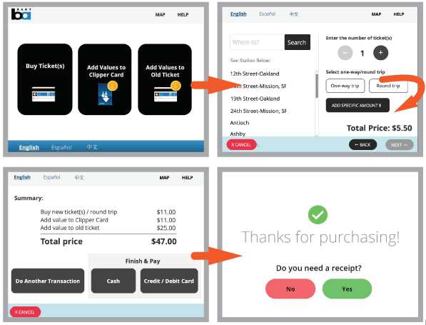
FINAL USER FLOW BUY A TICKET IN 4 EASY STEPS
LESSONS LEARNED
- This was my first time designing an interface, it was an engaging and interesting experience.
- Simplifying the process may indicate more screens at the beginning of the design process, but context is very important to take into account. In this case, less screens improves users’ process of buying tickets, since it takes less time for them to buy their tickets.
- Keep in mind HCI principles and mental models- top right = start, bottom left = end, which is why all users who participated in the study expected the Next button on the bottom left.
MORE PROJECTS…
